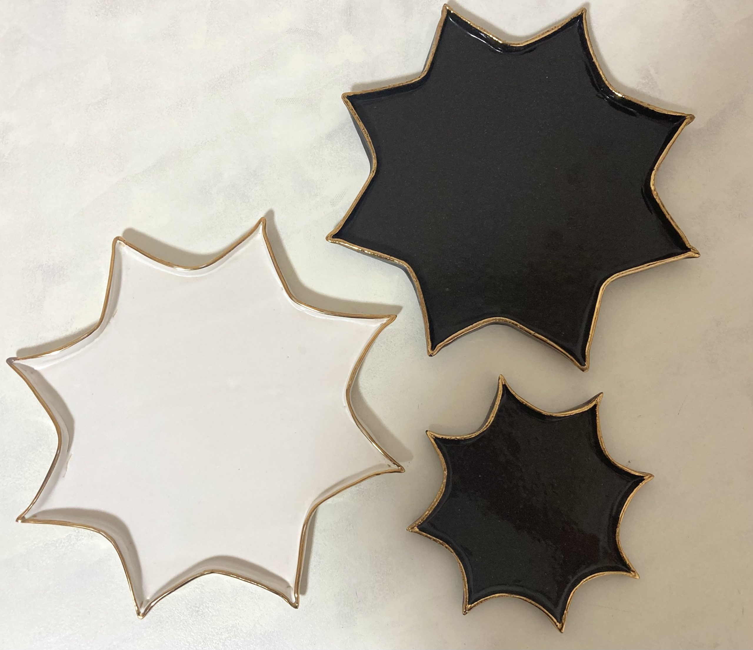
série habiller | ucacoceramics
111
archive,tax-portfolio_category,term-serie-habiller,term-111,edgt-core-1.0,ajax_fade,page_not_loaded,,hudson-ver-1.3, vertical_menu_with_scroll,smooth_scroll,blog_installed,wpb-js-composer js-comp-ver-5.5.2,vc_responsive
5月 28 2023

オクタグラム(八芒星)プレート

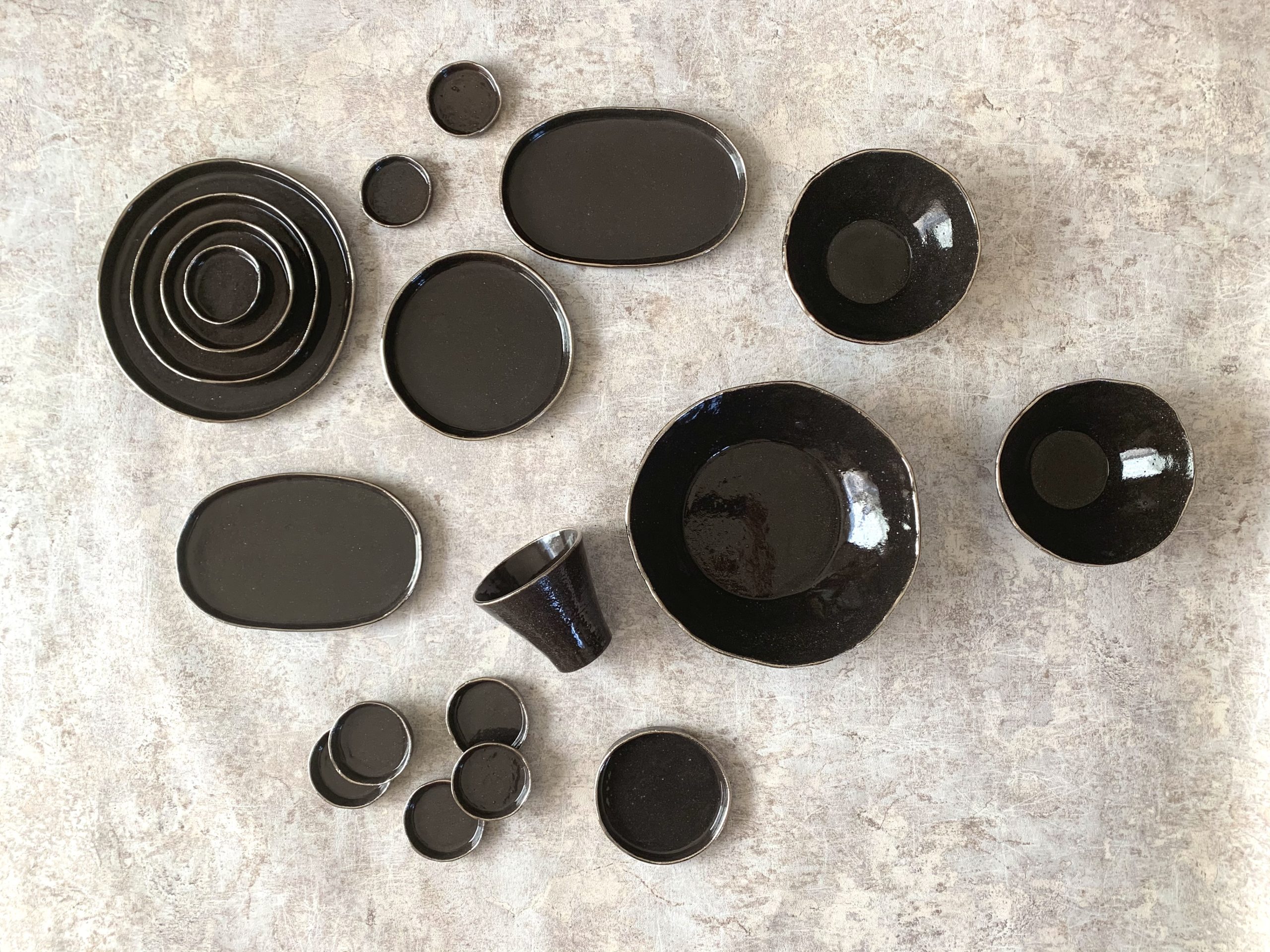
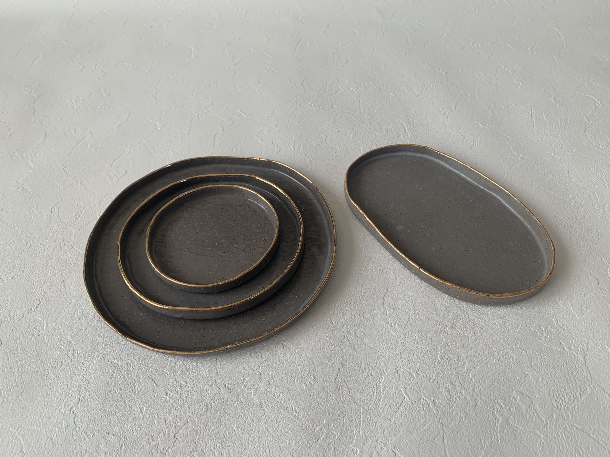
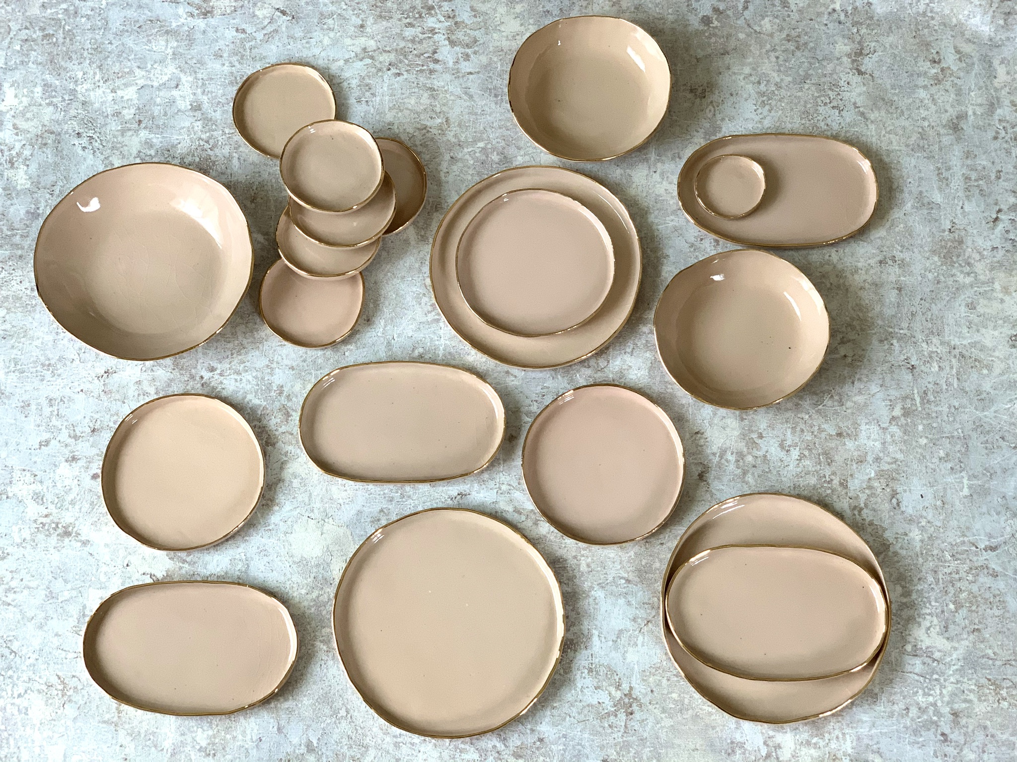
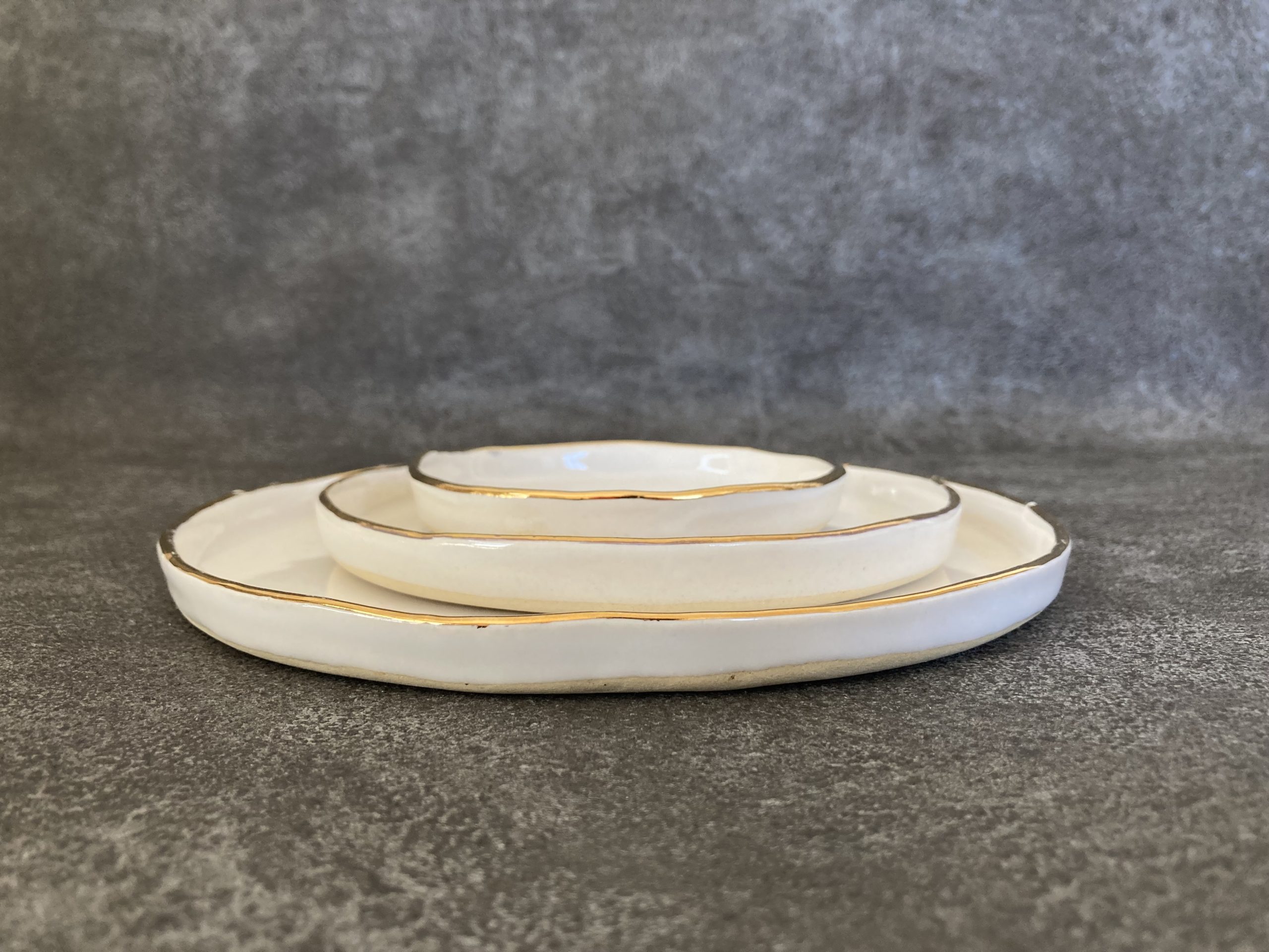
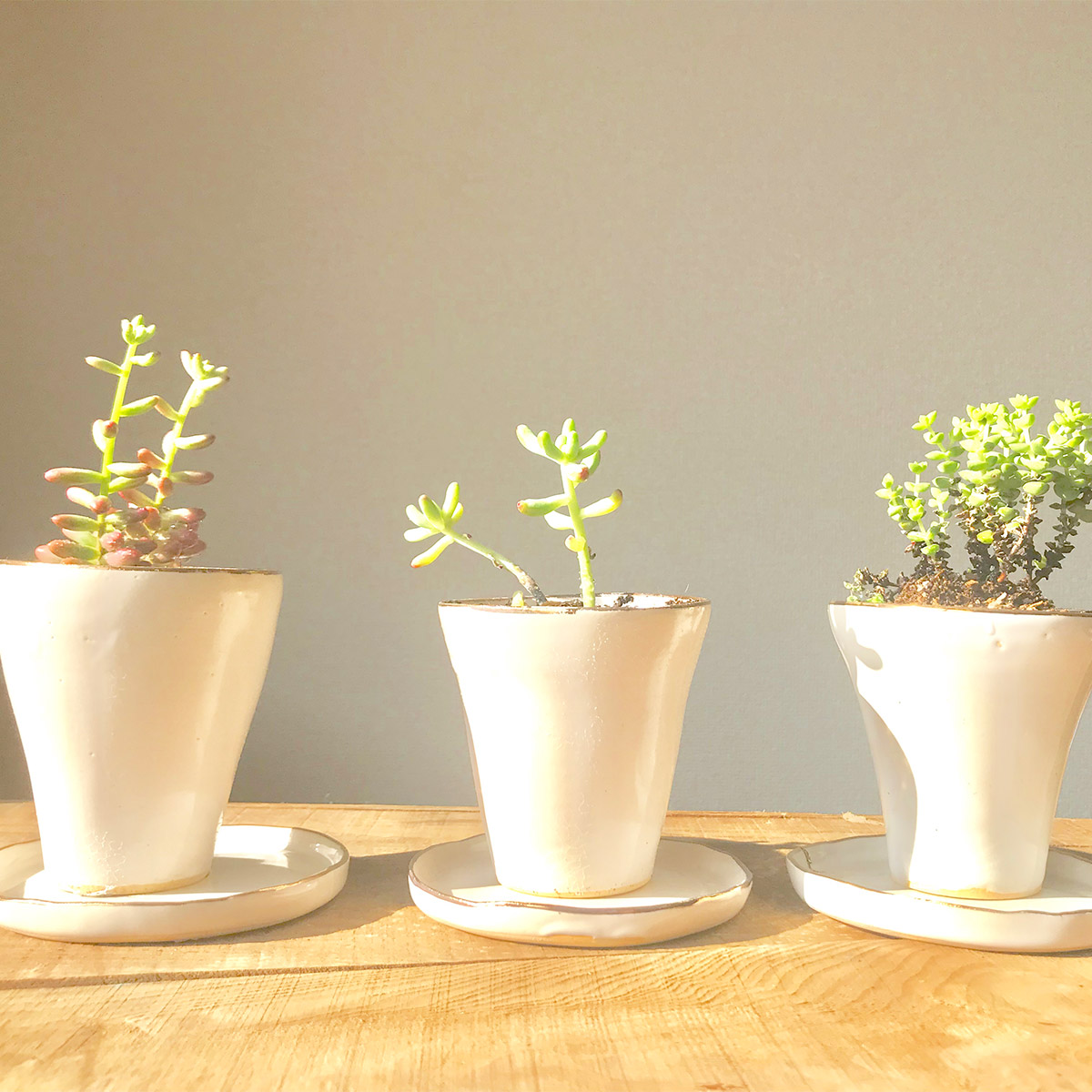
いよいよ色展開もカタチの展開も広がりを見せてきました。 The color variations and design expansions have finally started to show a wide range of possibilities.   円、楕円それ以外に食卓を華やかにするカタチは? What other shapes besides circles and ellipses can bring a touch of elegance to the dining table?   変わらずに愛される為に、進化する定番であり続けること。 To continue being loved while staying true to oneself and evolving. それが、あらゆる器を作りながら思っていたことです。 That is exactly what I had in mind while creating various vessels. 自宅のテーブルコーディネートで金彩の器を使うとき、縁に揺らぎを持たせているとはいえ、ほとんどの形が丸や楕円できちんとしすぎていました。 When using golden porcelain dishes for my home table setting, although I tried to add some variations to the edges, most of the shapes were too round or elliptical, appearing too neat and precise. カタチが規則的すぎると食卓にリズムが生まれず、楽しさが伝わりにくいと感じていて、丸いもの以外にも作りたかったのですが、四角というイメージがなんだかピンと来ていなくて決められずにいました。 I felt that if the shapes were too regular, it would lack rhythm on the dining table and make it difficult to convey a sense of joy. I wanted to create something other than round shapes, but I couldn't decide because I couldn't quite envision square shapes.   そんな時、2021年ごろからハマりだしたタロットカードに出てくる八芒星(オクタグラム)を器へと落とし込み、星形を製作しました。 At that time, around 2021, I became fascinated with the octagram (eight-pointed star) that appeared in tarot cards, and I incorporated it into my ceramics, creating star-shaped Plate.   2021年のホリデーシーズンに販売したら良かったのですが、そのタイミングには間に合わず、2022年1~2月ごろに製品化が実現しています。 I wish I had released them during the 2021 holiday season, but unfortunately, I missed the timing. The product development was eventually completed around January to February 2022.   星のカタチなので縁にはプラチナではなく金彩が使いたくなり、既存のカタチでも金の縁取りで展開を始めました。 Since it is a star-shaped design, I felt inclined to use gold accents on the...

Share Post
Read More
5月 27 2023

5年後10年後も続く愛される定番として⑤

ピンクやグレーの器の受注を受けながらも黒の器作りの為の時間も設けていました。 やっと、思い通りの黒で制作をスタートし始めました。 While accepting orders for pink and gray pottery, I also set aside time for creating black pottery. And finally, I have started the production with the black color I had envisioned.   [caption id="attachment_11801" align="alignnone" width="300"] シャープな黒に光り輝くプラチナ彩を               The platinum accents gleam and shine on the sharp black surface.[/caption]   黒は、ミルクベースのスープやヴィシソワーズに合わせたかったのでどうしても深さのあるボウルを作りたかったのです。 I wanted to create a bowl with depth because I specifically aimed to pair it with milk-based soups or vichyssoise.   <出来ればろくろで作ったお茶碗型ではなく、お皿と同じ手法のタタラ作りで作りたい>。という思いは黒の展開後、更に強まりました。 After the introduction of black pottery, my desire to create using the same technique as known as Tatara , grew even stronger. I preferred not to make it in the traditional tea bowl shape produced on a potter's wheel.   本当はスタート時の5型でもそうしたかったのですが、タタラづくりで高さのある物を作るのが当時の私にはとても難しく、ろくろでカップとボウルを作っていました。 Originally, I wanted to create taller pieces even with the initial five designs, using the Tatara technique. However, at that time, I found it challenging to craft taller objects using the Tatara method, so I resorted to making cups and bowls on the potter's wheel.   [caption id="attachment_11802" align="alignnone" width="300"] 初期はお茶碗型でスタート。こちらは炊き立ての白米が引き立つのです。                            started with a tea bowl shape initially. This shape beautifully accentuates freshly cooked white rice.[/caption]   ろくろで作ったボウルも好きなのですが、お皿同様、縁に柔らかな揺らぎを持たせたいと思うとボウルもやはりタタラづくりで制作したいと思いました。 While I do enjoy making bowls on the potter's wheel, when it comes to creating bowls,...

Share Post
Read More
5月 24 2023

5年後10年後も続く愛される定番として④

3色目の展開カラーはチャコールグレーの器を黒の代わりに。 The third color  chose a charcoal gray  instead of black.   [caption id="attachment_11999" align="alignnone" width="300"] グレーの器を展開し始めた時、最初に選んだ4型                                                                      charcoal gray was initially chosen in these 4 models[/caption]   黒が思い通りの色にならなくて探していたことはプロダクトフィロソフィーのブログ<5年後10年後も続く愛される定番として①>でも記載しましたが、その後いったん黒を作ることを保留にした時に、代わりに気になって選んだのがこちらの写真のグレーの土です。 In my blog post titled "As a Timeless Classic That Will Continue to be Loved 5 Years and 10 Years from Now - Part 1," I mentioned that I was searching for the perfect shade of black but was unable to find it. However, during the period when I temporarily put the black color on hold, I became intrigued by the gray clay featured in the attached photo.   それでも、黒じゃないにしても黒っぽい器が作りたい気持ちは変わらずにありました。 Nevertheless, my desire to create a container that had a blackish appearance persisted, even if it wasn't actually black.   豆腐料理、冷やしうどん、大根おろしポタージュスープなどの白っぽい料理にはやはり白い器より黒っぽい器の方がおいしそうに見えるからです。 グレーで作ってみると、土に入っている御影石の独特の表面感も相まって和洋折衷な料理に合わせやすい器となりました。 such as tofu dishes, chilled udon, and dishes with grated daikon or potage soup, tend to look more appetizing in vessels that have a blackish hue rather than pure white. When I experimented with creating gray vessels, the unique surface texture of the small stones complemented a variety of dishes that fuse Japanese and Western flavors. This versatility makes...

Share Post
Read More
5月 23 2023

5年後10年後も続く愛される定番として③

2色目の展開カラーはピンク The second color for the deployment color is pink.   [caption id="attachment_12018" align="alignnone" width="300"] 白の次に作り始めたのは<ピンク×ゴールド>のシリーズです。[/caption]   こちらも最初はピンクの釉薬をかけるという選択肢しかありませんでした。 Initially, there was only the choice of applying a pink glaze in this case. 既存の釉薬では好みの色が見つけられず、釉薬の自作などもしてみましたがそう簡単には好きな色が作り出せず諦めかけていた時に<土自体に色を付けることにしよう!>とマインドセットすることになりしました。 I couldn't find the desired color with the existing glazes, so I even tried making my own glazes, but it wasn't easy to create the color I wanted. I was starting to give up. But I decided to change my mind‐set to "Let's color the clay itself!"   濃度比率は途中で少し変更しピンクを少し濃くしました。 I made a slight adjustment to the concentration ratio along the way and made the pink color a bit deeper.   スイーツに合わせた器を作りたくて、このピンクの器の制作にあたったのですが最初はなかなか売れませんでした。 I embarked on creating dishes in this pink color to complement desserts, but initially, they didn't sell well.   当時はまだ、ピンクの器というのが珍しかったのか?あまり見慣れないことで使い方がわからないというお声をよく頂きました。(最近ではピンクの器もよく見かけますね) At that time, pink plate might have been considered unusual or less commonly seen. Many customers expressed that they were unfamiliar with how to use them, which could have contributed to the initial lack of sales. However, it's worth noting that recently pink plate has become more common and popular, and you can often find them in various settings.   なので、最初は卸先では断られてしまうちょっとしたキズなどのある完成品を自宅の食器として使い、実際に料理やスイーツを乗せて写真を撮ったものをSNSでUPしました。 As a result, when the initial products with minor imperfections were rejected by wholesale buyers, I decided to use them as personal tableware at home. I actually served dishes and desserts on them, taking photographs and...

Share Post
Read More
5月 21 2023

5年後10年後も続く愛される定番として②

Blk×Platinum(黒.プラチナ)はこの器のシリーズを製作するにあたり、最初に作りたいと思った色です。(5年後10年後も続く愛される定番として①参照。またこの色は実際には4色目の展開カラーとなるのですが、その話はまた次回の③話以降でつづらせていただきたいと思います)。 Blk×Platinum  is the color I had in mind as the initial choice for creating this series of vessels. (Please read that as a timeless classic that will continue to be beloved even 5 or 10 years from now, ① ) Furthermore, while this color will actually be the fourth variant in the lineup, I would like to continue discussing that in the upcoming ③ and subsequent installments.   乳白色には柔らなイメージでゴールドを、漆黒の透き通るようなつややかさをもつ深い黒にはプラチナの輝きをまとわせたかった。 こちらの色は少し冷ややかな印象なのかもしれません。 I wanted to combine a soft, gentle image of gold with a milky white color, and adorn the deep black with a glossy quality with the brilliance of platinum. This color may give a slightly cool impressin.   私は、相反するものを1つのモノゴトの中に、あるいはプロダクトの中に内包し表現することが好きです。 この世に存在するおおよその物事には陰と陽が存在します。 そんな様子を表したかったのかもしれません。 I like incorporating opposing elements within a series or product, expressing the coexistence of Yin and Yang, which can be found in most things in the world. Perhaps that is what I wanted to depict.   白黒はっきりさせたい、というのではなく白と黒にはすべてが内包されるという事だと思っています。 この金彩、プラチナ彩の器は現在では5色展開しているシリーズです。 I believe it is not about clearly defining things into one or the other, but rather recognizing that everything is encompassed within the of white and black. The vessels adorned with gold and platinum accents currently form a series available in five different colors.   ある時期は色や形を絞ろうか、どうしようか?と悩み、迷い、何度も思考を巡らせては結局変更しない、という堂々巡りを繰り返していました。 There was a period when I struggled and pondered over whether to narrow down the colors and shapes, going back and forth...

Share Post
Read More
5月 21 2023

5年後10年後も続く愛される定番として①

2018年の開業当初からブランドの定番として育ててきたK24(orプラチナ)を縁取った器たちについて改めてご紹介させていただきます。 I would like to reintroduce the collection of vessels adorned with the K24 (or Platinum) brand, which has been nurtured as a staple since its inception in 2018. このシリーズの制作時、<5年後10年後も続く愛される定番を作りたい>と考えて作陶にあたりました。 During the creation of this series, I aimed to make a timeless classic that would continue to be beloved even after 5 or 10 years. それまでの、趣味として楽しむ作陶だけでなく、〈好きなこと〉を〈ビジネス〉にするために定番のシリーズを作りたいと考えたからです。 It was not just about enjoying pottery as a hobby; I wanted to turn my passion into a business by creating a signature line. その際に最低限のイメージだけはコンセプチュアルに決めようと思い、やりたいことやイメージ、思い浮かんだキーワードを全てノートに書きだしました。 To establish at least a basic concept, I wrote down everything I wanted to do, the imagery I had in mind, and the keywords that came to me, filling my notebook. 2重線で消してはまた書き足し、書いては消し、を何度も繰り返しながらイメージを固めていきました。 I drew lines, crossed them out, and added more, repeatedly refining the image. この作業をしているときからすでに私の作陶が始まっていたのだと思います。 I believe that even during this process, my pottery journey had already begun. 物理的な理由で、どうしてもタタラ皿をメインにした商品展開にしたかったのです。最初に作ったのはこの3つのサイズのお皿です。 Due to practical reasons, I wanted to focus on the Tatara plate as the main product. The first items I created were these three sizes of plates. あの時、タタラ皿をメインアイテムにしたことは、それまで趣味で作陶していた時とは真逆とも言える選択でした。 Choosing to make the Tatara(flat) plate the main item was a decision that went against the grain of my previous experience with pottery as a hobby. 2007年から2017年までの10年間、私はほとんどタタラ皿を作ったことが無く、どちらかというと苦手な制作方法でもありました。 From 2007 to 2017, I hardly ever made Tatara(flat) plates, and it was actually a technique that I struggled with. いつも制作は電動ろくろで薄く引き、見込みの小さく高台の高めの小鉢や碗皿ばかりを作り、和の雰囲気が強い釉薬掛けを好んで作っていたので、開業前の私の作風を見ていらした方は急にテイストが変わって驚かれた方も多かったと思います。 My usual...

Share Post
Read More
12月 04 2018

B品活用法

sériehabi habille(おめかし)した金彩の器 カップの底にヒビが入ってしまったものや、お皿面が汚れてしまったものなどを組み合わせて多肉植物を植えたらとても愛らしくなりました。 自分が作ったものだけでなく、モノを簡単に捨てられないタイプなのでB品も出来るだけ活用しています。 他の器でも鉢植えにしていきます。   <2018年製作、リサイクルアイテム>...

Share Post
Read More